About six months ago, I attended a workshop hosted by SailThru’s VP of Analytics & Optimization, Cassie Lancellotti-Young, that covered a lot of ground in terms of focusing on “metrics that matter” when it comes to your newsletter. While I could have hunkered down and spent the next month geeking out to our newsletter’s data based on the techniques I’d learned, the day to day of the business made that not feasible.
However, one thing really stuck with me and six months later was still lingering in the back of my mind: cohort analysis. So when it came time for CB Insights’ Hack Days last week (an employee-driven event where we dedicated numerous days towards the exploration of experimental projects), I figured what better time to dive right in and geek out to behavioral data surrounding our newsletter’s 48,000+ subscribers? We are adding 500-1000 new subscribers per week so it made sense to figure out how we could make the newsletter better and ensure we were engaging subscribers with the right content at the right time.
What is Cohort Analysis?
As smartly explained in this KissMetrics post authored by Christoph Janz, “a cohort analysis can be broadly defined as a dissection of the activities of a group of people (such as customers), who share a common characteristic, over time.” For example, a cohort’s shared characteristic could be type of user (investor, salesperson, consultant, etc.) or alternatively the date a person subscribes to a service. And as far as the analysis part is concerned, it’s choosing one behavior that you’d like to zone in on and then observing that behavior over time and seeing how it varies across cohorts.
Clear as mud, right? If so, let’s fix that by showing you exactly what we did…
Defining the Cohorts
In our case, we were interested in observing our newsletter readers’ open rates over time. Specifically, we decided to study the past year’s worth of newsletters: 173 of them to be exact. While we’ve been publishing newsletters since 2010, we decided to zone in on only the past year as that’s when we really hit our stride. You can read more about how our newsletter numbers sucked for some time due to a variety of factors before we really committed to content marketing as a serious growth engine for CB Insights. But I digress.
Over the past year, we’ve had over 40,000 people subscribe to our newsletter. We took each one of these 40,000+ people and assigned them to a cohort, 1 to 173, based on which campaign was their first. So, for example, if Sadie subscribed back in October 2013 before the very first newsletter we included in the analysis, she’d be in the first cohort. On the other hand if Sawyer joined up during the first week of February 2014, he’d be in the 54th cohort. So on and so forth until each one of the 40,000+ subscribers had a cohort.
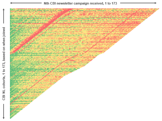
The results: open rates by cohort
In the example above, we’d have 173 data points on Sadie’s opens because she received all 173 newsletters, while for Sawyer we’d only have 119 data points because he joined up in the 54th cohort. Now imagine observing this data across 40,000+ individuals across 173 cohorts and 173 campaigns. The end result produced over 1 million rows of data which, using a combination of Python, MySQL and Excel wizardry, we boiled down into an open rate heatmap that looked like the following (note that green represents high open rates, red represents low open rates while shades of yellow and orange represent everything in between):
Observation 1: Open rates are higher in the beginning of a subscriber’s life cycle
Perhaps not the most earth shattering discovery, but as highlighted in the color box below, open rates are strikingly higher during the beginning of a subscriber’s life cycle.
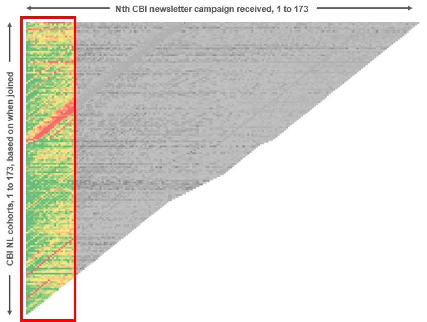
While in a later blog post we will do a deep dive to address the precise “tipping points” of when open rates start to decline, it suffices to say that there’s a limited window during which we have the reader’s heightened attention. The goal, of course, is to find ways to push that window further out to the right, meaning sustained engagement over longer periods of time.
The options to improve the long-tail results are numerous, but the upshot is that we’ll be experimenting with sending carefully curated content to our readers for the first couple of weeks of their subscription to ensure we’re a habit. In other words, instead of putting them on to the regular newsletter list immediately, ensure that they receive our historically top performing content first. Theoretically, all of our content is equally enthralling, but in reality some pieces are more enticing than others. We’ll lead with the sure winners first in an effort to earn longer-lasting readership over time.
Observation 2: Not all cohorts are created equal
While open rates were markedly higher for all cohorts at the beginning of their respective life cycles, this was especially true for a concentration spanning cohorts 95 to 101. Specifically, the high open rates for these cohorts seem to reach further to the right, meaning higher-than-average levels of engagement were longer-lived.
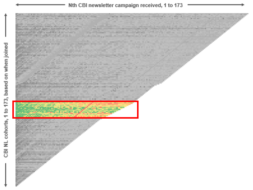
As a logical next step we dove into those cohorts to get a better understanding of where they came from in effort to find more like them. Unbeknownst to us prior to this analysis, turns out that a few specific marketing channels we were exploring at that time yielded highly engaged newsletter subscribers. Needless to say, we’ll be aggressively returning to those channels. Since I’m being a bit vague, you may be asking yourself “which channels are you talking about”? If you’re really curious to know, you’re going to need to join our team first.
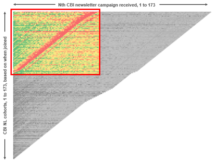
Observation 3: What’s up with that big, ugly red scar?
While this wasn’t explicitly pointed out earlier, each diagonal represents a separate newsletter campaign. In April of 2014, we noticed some deliverability issues with our newsletter having to do with technical issues that were beyond our control. Well there it is in full effect with the big red scar you see below. Glad that it was short-lived and that those days are behind us.
What’s next?
While this analysis just scraped the surface of what can be done via cohort analysis, we nonetheless made some significant and actionable discoveries. But these are just opens. What about clicks and shares? How have those metrics varied as we’ve changed our newsletter format over time (which we’ve done more than once over the course of the past year)? All great questions and those are topics we look forward to addressing shortly.
Moreover, we can apply a very similar analysis to not only the newsletter, but what’s actually happening on the CB Insights platform. How are people engaging over time? Are new features being adopted? How are our marketing / on-boarding techniques influencing site behavior? The permutations are endless – it’s simply a matter of striking the right balance between wonky data science and practicality. Regardless, this was an eye-opening exercise that we’ll be sure to repeat in the future across various areas of our business data in an effort to optimize engagement across a variety of channels and products.
If you’ve used cohort analysis to analyze your newsletter subscriber behavior or in other interesting ways, would love to chat in the comments about what you did and what you learned and how it’s changing your business.